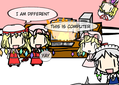
Added a revised version of
Flandre to create.swf. For some reason, the hat and the hair look a bit strange to me, but I guess that might just be because I’m so used to seeing the older version(s) of Flandre, especially the one from the Touhou flashes. I spent awhile changing the hair around, but it still looks strange to me. Here’s an
earlier version of the preview screenshot; I don’t know why I decided to flip the positioning around in the final one, but basically the only real difference is revised Flandre’s hair.
I might end up doing another revision some time in the future (unless most people think it looks fine, then I guess I’ll just leave it). Anyway, I think the hat looks more like a Remilia hat than a Flandre hat (again, probably because I’m used to the older hat), so when I revise Remilia, I might use this hat as hers, and make another one for Flandre.

wow, flandre looks much better now. good job.
Ah, I was waiting for this. Kept refreshing the page.
Anyways, IS ANOTHER TIME PARADOX!
I personally like the hair in the earlier version (with the inverted directions) but that’s just me.
NO WAY THAT’S IMPOSSIBLE!
anyways, when Remi comes, we want also Vampire bats for her
The jump in detail level on the new-rendition characters’ outfits continues to be a steady indicator of how much better you’ve gotten since you drew the initial versions.
As for Flandre’s hair, I’m guessing the problem is her side-ponytail, which tends to be minimized or hidden in a lot of her depictions, and so throws one off when it is more prominently visible. Or maybe I’m totally wrong.
On another note, I imagine I’m not the only one who can’t look at tiny pink Flandre any more without hearing a sheep bleating…
Taboo “Three of a Kind”
Flan flan
@Chaos42: Oh, so that’s what happened to That Character’s sisters.
Er, while we’re here, though… I’ve got a very important question. See, I was browsing the net the other day, and… well… what’s sex?
For the first time, I don’t see any “First post” or anything like that yet… Also I feel the old, old flandre looks more classic.
Her spell card not complete D8 needs one more revised flan flan~ lol
and i sense theres going to be a revised Remi… either that or patchy
@Sprocket: The case with the side-ponytail here is that KirbyM draws them facing to the right (or left in their point of view, you know), and even then, this new Flandre’s ponytail is decently noticeable.
That is, if you know about the existence of her side-ponytail because it seems some people are not even aware of it
Flan-chan ufufu.
I like both :D
@Pipokary: YYYYYES!
Keep doing revised versions pwease :3
But Remi’s bonnet has a bigger ribbon with a white stripe on it, though.
Nice! I love the new design. =D
Perhaps you flipped the positioning so that New Flan’s side-ponytail and ribbon would appear to be on the wrong side of her haid. Also, is Flandre’s hat really that much different from her sister’s? I thought the main point was simply that the ribbon was on the other side… =/
@Fubu72: Lol, Yukari. Are you worrying about showing too much fondness of Remi in front of Flan with your “fangirl Sakuya” moments? xD
Hmm … yeah, I think the side-ponytail-thing is more prominent than usual. Though once Remilia gets redone, I’ll have to redo comic #53 …
Speaking of which, here’s comic #61!
Oh right, I forgot to mention: is it possible (i.e. without requiring help from Thefre) to set a max-length for input fields? If so, I would really appreciate setting the max-length of the “rows” and “columns” in the Cluster options to “2.” Or some other means of validating input so you don’t accidentally end up putting in 186 when you meant to put 18 in order to replace the previous value of 16, thus causing it to try to make a cluster of OVER NINE THOUSAND components …
Doesn’t anybody think the shards on the wings look too similar? The old ones seem way better in that sense, while the new ones have a feeling of copy-paste.
Hmm…somehow i think the old Flandre has a better stare than the new one.
Like she is on lcd but can still see through your soul.
The best Flan would be pajama version… staring right through your soul…. meeeeh”sheep bleating”
3 flandres = GENSOKYO DOMINATION!!!!!!!!!!!!!
flandre: lets dominate the world
Flandre 2: yeah
flash flandre: whats domination?
Flan 1 & 2: O_o
“This is computer” :D
I love flash flandre
@SomethingUnreal: Truth is that, the fourth Flandre in Four of a Kind is in reality Remi in disguise. Yeah I don’t know what I’m saying either.
A revised Flandre! hooray!
I like the old one too, she looks younger and cuter.
The new flan looks really nice, and from what my eyes told me, her side ponytail(?) looks to be alright, basing in the touhou kyouku flandre video and what google says.
@Sprocket: yeah, I konw what you’re talking about. XD
for some reason the old hat looks cuter?! it could be the huge frills…
Next ⑨;
Yuyuko
Kaguya
Cirno
Eirin
Youmu
Patchouli
Alice
Reisen
Mokou
Looking at their profiles again, I think their hats look pretty much the same.
Coming soon:
Remilia.
IN HIGH DEFFINITION